2,156 search results
(0.008 seconds)
- Miama - 100% free

- Miamo by Larin Type Co,
$14.00 Miamo is an elegant and modern font family. It includes script font and sans serif in six weights from Thin to Bold. Sans serif font is a multi-purpose font that is perfect for any project, it is contrasted, modern and easy to read. With it, you can create logos, use in advertising, packaging, book covers and magazines, headings, descriptions and much more. Handwritten script font elegant and charming, it includes alternatives and a variety of ligatures that will make your project unique. This font is easy to use has OpenType features.
 - Minami by Andrey Font Design,
$9.00 Minami is a trendy handwritten font featuring a neat style. This gentle font will look gorgeous on various design ideas. It will add a joyful and romantic touch to each of your projects!
 - HeLLO MIAMI by Yoga Letter,
$15.00 "Hello Miami" is a unique display font. This font is complemented by palm tree and beach decorations. It is perfect for your summer season. In addition, this font can also be used for a variety of your needs (product promotion, holiday promotion, congratulations, invitations, quotes, social media status, logos, branding, banners, posters, prints, etc.)
 - EF Miami by Elsner+Flake,
$35.00 - TV Nord by Elsner+Flake,
$39.00The typeface family TV Nord is based on the corporate typeface NDR Sans which was developed by Elsner+Flake for the Norddeutsche Rundfunk (www.ndr.de) between 1999 and 2001. This new design came into being as part of a complete overhaul of the visual image of the NDR. This became necessary because the NDR, founded in 1954, incorporated the stations of the East German states Mecklenburg-Vorpommern (1992) and Brandenburg (1997) after the re-unification of Germany. The Hamburg advertising agency DMCGroup developed a new and unified image for the NDR which is in existence to this day. The typeface TV Nord relates to the design of the Trade Gothic and similar American sans serif typefaces of the early part of the last century. Its development concerns itself as much with good legibility for print, as it does for the reproduction on TV screens, which among others, is achieved through its high x-height. The logotype for the NDR as well was developed from the capitals of the NDR Sans. In 2014, the TV Nord was revised stylistically and expanded to incorporate all European-Latin languages. As part of this effort, further complementary cuts were added. - Hi TV by Yebhu,
$15.00 Hi TV is an good-humored and energetic display font. Although being an all caps alphabet, it counts two versions for a letter, easily accessed choose uppercase or lowercase. These slightly different letterforms will bring spontaneity and vitality to your designs. Crunching noises guaranteed!
 - Segoe TV by Microsoft Corporation,
$39.00The Segoe™ TV font family was originally developed for MSNTV. Segoe TV italic was designed with attributes for improved legibility on TV screens. Segoe TV italic includes the Latin-1 character set. - Bomber TV by Kustomtype,
$25.00 I was asked by a good friend of mine to design his tattoo lettering. This fellow prefered an easy stencil with no ornament, such as swirls or loops. After some preliminary design I finally accepted the challenge and while completing the whole alphabet, the idea of creating a cool font of it occured to me. Only a few months later this new font family already contained 4 weights, every weight has a companion Italic style, punctuation, numerals and mathematical operators, as well as all accented characters. Bomber TV is a brand-new font and all glyphs have been contemplated very carefully so that all characters match in a well-balanced and streaming way. In both shaped weights, the font suits extraordinary well for headings, slogans etc. The cleanly cut and powerful Bomber TV font can easily be used for logotype, games, prints, magazines, web, apps, packaging, posters, T-shirts, signage & design projects. The font is original and custom made by Kustomtype.
 - TV Western JNL by Jeff Levine,
$29.00 In the 1889 Franklin Type Foundry specimen book is a type face called “Armenian”. With lighter weight horizontal slab serifs than more traditional Western fonts, it could be pictured as being used as copy on wanted posters or town notices. This is now available as TV Western JNL in both regular and oblique versions.
 - Vega TV SH by Scangraphic Digital Type Collection,
$26.00 Since the release of these fonts most typefaces in the Scangraphic Type Collection appear in two versions. One is designed specifically for headline typesetting (SH: Scangraphic Headline Types) and one specifically for text typesetting (SB Scangraphic Bodytypes). The most obvious differentiation can be found in the spacing. That of the Bodytypes is adjusted for readability. That of the Headline Types is decidedly more narrow in order to do justice to the requirements of headline typesetting. The kerning tables, as well, have been individualized for each of these type varieties. In addition to the adjustment of spacing, there are also adjustments in the design. For the Bodytypes, fine spaces were created which prevented the smear effect on acute angles in small typesizes. For a number of Bodytypes, hairlines and serifs were thickened or the whole typeface was adjusted to meet the optical requirements for setting type in small sizes. For the German lower-case diacritical marks, all Headline Types complements contain alternative integrated accents which allow the compact setting of lower-case headlines.
 - Vega TV SB by Scangraphic Digital Type Collection,
$26.00 Since the release of these fonts most typefaces in the Scangraphic Type Collection appear in two versions. One is designed specifically for headline typesetting (SH: Scangraphic Headline Types) and one specifically for text typesetting (SB Scangraphic Bodytypes). The most obvious differentiation can be found in the spacing. That of the Bodytypes is adjusted for readability. That of the Headline Types is decidedly more narrow in order to do justice to the requirements of headline typesetting. The kerning tables, as well, have been individualized for each of these type varieties. In addition to the adjustment of spacing, there are also adjustments in the design. For the Bodytypes, fine spaces were created which prevented the smear effect on acute angles in small typesizes. For a number of Bodytypes, hairlines and serifs were thickened or the whole typeface was adjusted to meet the optical requirements for setting type in small sizes. For the German lower-case diacritical marks, all Headline Types complements contain alternative integrated accents which allow the compact setting of lower-case headlines.
 - Pea Mimi - Unknown license

- Mimi MF by Masterfont,
$59.00 Simple yet decorative serif stroked font . Use for titles, signage, captions etc. Highly legible at children books.
 - Old Miami Beach JNL by Jeff Levine,
$29.00 The grandeur of what was Miami Beach had its golden years peak in the 1940s. One of the grande dame hotels that stood at Collins Avenue and 23rd Street was the Roney Plaza; built in the 1920s and demolished around 1969. An online auction offered a pair of gummed labels provided by the hotel to be used by their guests for shipping souvenir packages back home, thus also giving the hotel a promotional plug. Jeff Levine not only created two typefaces from this hand-lettered label - Old Miami Beach JNL and Old Miami Beach Nights JNL (a solid black version), but painstakingly recreated the look of the label for the promotional flag and banner for the fonts.
 - Asie - Unknown license

- Cayed by Allouse Studio,
$16.00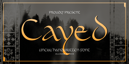 Proudly Presenting, Cayed a Uncial Handwritten Font that will bring an classic feel for your need. Cayed is perfect for any titles, logo, product packaging, branding project, megazine, social media, wedding, or just used to express words above the background. Cayed also come with Multi-Lingual Support. Enjoy the font, feel free to comment or feedback, send me PM or email. Thank You!
 - Isis by ITC,
$29.00Isis is the work of type designer Michael Gills, an all capital, classical looking display roman typeface with an open engraved effect. It can be used alone or in combination with most established classical roman typefaces. Isis is ideal for a wide range of headline applications and gives text a look of quality and excellence. - As seen on TV - Unknown license

- MVB Cafe Mimi by MVB,
$39.00Kanna Aoki was designing fabrics and dishware for several major manufacturers when she designed MVB Cafe Mimi. The design came from a few words Aoki painted as decoration for a set of cappuccino cups. Aoki created the Regular weight for MVB Fonts using a brush. The Bold was adapted after digitization. Using several double-letter ligatures, the fonts can feel as natural and spontaneous as the original hand-painted lettering. Despite its curlicues and free-flowing forms, great care was taken to keep this script balanced and legible. It skips and hops along the baseline but doesn't lose its step. - As seen on TV Skew - Unknown license

- !Lestatic CSS - 100% free

- Gargoyle SSi - Unknown license

- USIS 1949 - Personal use only

- Sci Fied - 100% free

- Samovar SSi - Unknown license

- Sci Fied - 100% free

- Chi-Town - Unknown license

- SCSI Port - Personal use only

- Sci Fied - 100% free

- Sci Fied - 100% free

- Gizmo SSi - Unknown license

- Umber SSi - Unknown license

- SP Isis by Remote Inc,
$39.00They say the Nile has many secrets and she was the most sacred of them all. Isis. I met her in a small tavern outside of Edfu, hidden like a jewel between Luxor and Aswan. I had journeyed to Egypt to study the mating habits of homosexual hippos. I had no idea it was the journey that would teach me the true nature of love. - PSI Leaves by FontFuel,
$19.00 This is a leaves symbols font. Font elements are created from a base set of leaves. What that means is they work perfectly together. Professional artists and designers will appreciate all the ways you can combine these elements or use a single one for a simple elegant logo design. PSI Leaves works great for borders by simply creating a repeating pattern. Scrap-bookers can create beautiful and complex page designs with a few clicks. Thousands of uses equal thousands of ideas!
 - Kick Start SSi - Unknown license

- Snippet Script SSi - Unknown license

- id-isi-LightOT - Personal use only

- Sci Fied Outline - 100% free

- Sci Fied X - 100% free


Page 1 of 54Next page